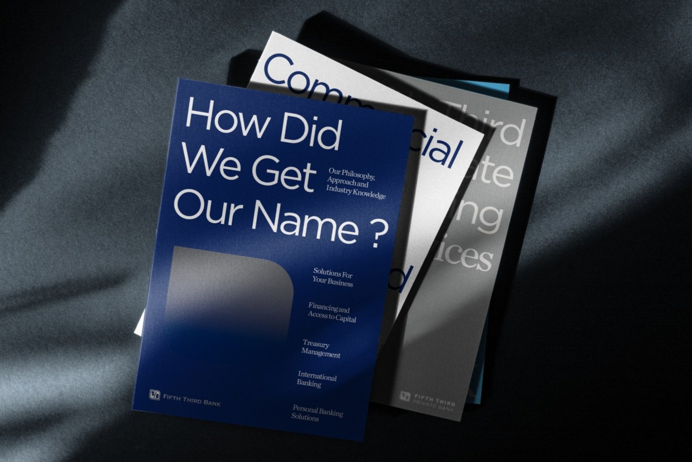
Fifth Third Bank Branding
Background: Among the largest money managers in the Midwest, Fifth Third handles $33 billion for individuals, corporations, and not-for-profit organizations through its Trust, Brokerage, and Insurance businesses.
My role: I worked on the brand guidelines as well as a multi-channel playbook to implement its branding for different channel purposes.
Results: Brand awareness went up 160%.
Logo
Our logo is composed of two main components — the symbol and the wordmark. It is designed to use specific proportions that should not be altered. These proportions were designed to accommodate a variety of uses.
Brand Architecture
Fifth Third operates as a branded house, meaning that the company itself is the brand, and its products or services are subsets of the main brand.
Color Palette
Color is a powerful means of visual expression. It is very important to be consistent in the way that we use it to build awareness for our brand and to distinguish ourselves from our competitors. This extensive color palette is unique to our brand. Use it consistently to create a rich and harmonious brand experience.
Graphic Elements
From the shape of our symbol, we have defined a set of graphics to support our brand’s visual presence and to differentiate us from our competitors. These graphic elements should be used consistently and correctly to build awareness of the Fifth Third Bank brand. They are versatile and flexible.
Typography
Our primary typeface is Gotham. It should be used across all Fifth Third Bank communications both on and offline.
Photography
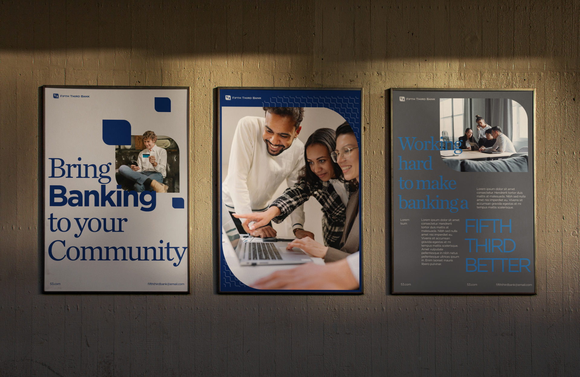
Our brand photography is based on five guiding principles: Authenticity - Action - Color - Community - Experiences and divided into two distinct categories: Lifestyle & Product.
Stationery
Offline Media


